Creating a Form using Form Builder
The following procedure describes the steps to create a sample form to record employee information using the Form Builder utility.
The example illustrates the following controls:
- Section
- Text box
- Option buttons
- Drop-down list with options defined from a Library catalog
- Condition based form controls
- Static grid
Steps
- In the module menu, click Administration.
- In the navigation pane, click Form Builder.
The Forms List page is displayed. - Click New.
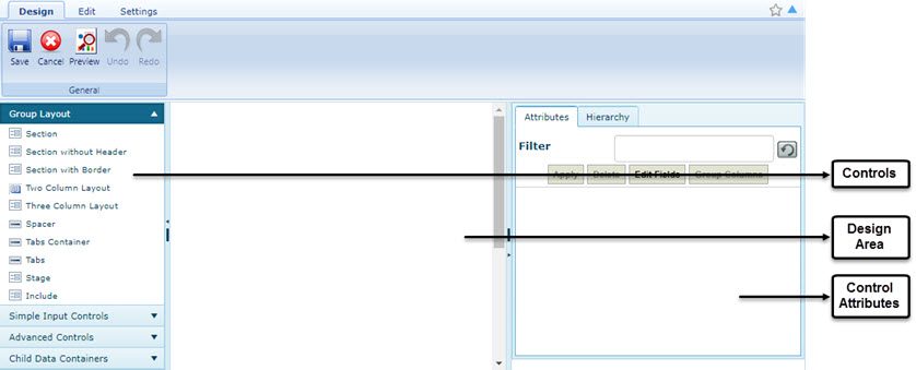
Three tabs, Design, Edit, and Settings are displayed. The Design tab displays the form structure, the Edit tab displays the HTML code of the form, and the Settings tab enables you to define the form name, and the module where the form must be available in the application at runtime. Each tab is divided into 3 panes, the left pane, center pane, and the right pane. The left pane lists the controls to design the form, the center pane displays the form structure, and the right pane displays control attributes.
- To design the layout of the form, first create a section. A section provides a boundary in the design area to add controls.
- In the controls pane, expand Group Layout, and then drag and drop Section to the design area. The label Section001 is displayed in the design area.
- In the design area, click Section001. The control attributes pane displays the attributes for Section001.
- To define the attributes of the section, enter information in the Attributes section, as described in the following table:
Attribute Description Caption This denotes the display name of the section.
Enter Employee Details, and then click Apply for the section name to be changed from Section001 to Employee Details.
Name This is a automatically generated name to identify the section, and need not be modified.
This is also the name of the column in the database, and is used to derive the name of the HTML item that is rendered.
Height This sets the height of the section. Normally for section controls, the height need not be set and the section sizes itself based on the controls that are contained within it. Width This sets the width of the section. Normally for section controls, the width need not be set and the section sizes itself based on the controls that are contained within it. Attributes This allows you to add tags or attributes to the section (or control) which can be used for further validations. For example, a field can be enabled/disabled based on the value entered in another field.
Attributes allows setting of CSS attributes for the control.
This is a section style attribute. Formatting or font styles are set here. For example, the following specifications will introduce a black border of thickness 1 pixel, underlined text of the caption and a left indent of 60 pixels within the frame.
Click
 to specify style attributes. In the box, enter Border: Solid 1px Black; text-decoration: underline; padding-left: 60px;. Click OK.
Click Apply to notice the changes in the section.
to specify style attributes. In the box, enter Border: Solid 1px Black; text-decoration: underline; padding-left: 60px;. Click OK.
Click Apply to notice the changes in the section.Orientation Orientation can be Vertical or Horizontal depending on the requirement of the form. In a form, a section can contain other sections in a hierarchy. This is useful for organizing controls in columns. The Orientation attribute for a section causes the parent section to layout its child sections horizontally or vertically. Stage This enables certain sections of a form to be made visible, hidden, or read only in certain stages of the workflow of the form.
For example, in the Request for Information form, the Response section is not editable in the Draft stage, so that section is created as a stage in the form and in workflow that stage is made read only in the Draft stage.
Visibility This controls the default visibility of the section (collapsed/expanded).
- Perform the following steps to create a text box:
- In the controls pane, click Simple Input Controls, and then drag and drop Single Line Text into the Employee Details section.
Note: Drop a control within the confines of the section for the control to be displayed in the design area. - Click TextBox(num), and in the Caption box, enter Employee Name. The various attributes of the control are listed below:
Attribute Description Caption This denotes the display name of the control.
The name to render on the display surface. If the caption is not set, then the default caption is set to the Name attribute of the control. To set a control with no title, delete the caption.
In this example, it is set to “Employee Name”.
Name This is a system generated name to denote the control. You need not modify this field; however, normally a form designer provides names that represent the meaning of the data in the field. Name attributes should not have spaces in them, and they must be unique throughout the form.
The name field is used to create the underlying database column name and to derive the name of the rendered HTML item.
Height This is used to set the height of a control in the user interface. Width This is used to set the width of a control in the user interface. Type This determines the options to select the type of control required in the form.
For example, you can add a text box to a section and later change it to a drop-down list.Value You can specify a default value to be displayed in the control.
Also, you can also use the Value field to retrieve system level information during display processing.
The supported format values include the following:{CURRENTUSER} - Displays the user name of the logged in user.
{CURRENTUSERNAME} - Displays the first name of the logged in user.
{CURRENTDATE} - Displays the current date.
{CURRENTDATETIME} - Displays the current date and time.
{CURRENTTIME} - Displays the current time.
{PROJECTNAME} - Displays the name of the project.
{PROJECTCODE} - Displays the project code.
{CONTRACTNAME} - Displays the name of the contract
{CONTRACTCODE} - Displays the contract code.
{PRIMECONTRACTOR} - Displays the prime contractor the project.
{_FORMULA: formula}
{_REQUEST: state info field}
{_DB: db expression}
{_Picker: [name Of Thepicker that is defined in this xml]}
"any static text" - Displays the text entered here.
DBType This is used to specify a data type of the control to be stored in the database. You can specify it as Varchar, Char, Number, Date. You can specify all fields as character strings in the database, and that is the default. However, you can change the database type to match how you want the data to be represented in the database. DataSource This is used for controls such as drop-down lists and radio button lists where options are retrieved from a database table. Data sources are specified in the format:
Table Name; Display Column; Value Column.
For example, LIBRARYResManPower;Description;ResItemID.
This is further explained later in the topic.Attributes This enables you to define tags or attributes to the control that can be used later for further validations.
EditMode This attribute defines whether a control within a form that is editable can be edited. For example, if a form is in edit mode and has a text box, setting the EditMode attribute to Edit renders the field editable, View renders the control read only, and Hidden hides the control in the form. Hidden This is set to True to hide the control in the form. This is useful for storing information in a form that is used in VisibleIf and EnableIf. ReadOnly If set to true, the data in the form is made read only. That is, the data cannot be modified by the end user. MaxLength Sets the maximum number of characters that can be entered in the text box. Enabled This enables/disables the control. ColumnGroup To group controls, enter the name of the column. Used primarily by dynamic grid, static grid, and checklist group.
ValidateOn This attribute can be used to validate the required fields on custom menus/button.
RequiredIf This allows to mark a field mandatory based on a condition.
Accepts javascript syntax as input. You can specify more than one condition in the following format: $ControlName;Operator;Value || $CN2;Operator;Value
DisableServerSideValidation This flag can be used to ignore server side validation before save.
CustomAttributes This enables you to define tags or attributes to the control that can be used later for further validations.
RowSpan Used for Static Grid to merge multiple rows. ColumnSpan Used for Static Grid to merge multiple columns. ErrorMessage You can customize error messages based on the validation set on a control. FilterKey Mainly used in the list pages and pickers to filter records that are displayed.
ForeignKey To set the control to be the Foreign Key in the associated table, this needs to be set to “True”. By default, it is selected as “False”. The Primary Key rules also apply to the Foreign Key attribute. For additional information, see Primary Key. CustomFormat Custom format can be specified for the controls which need to formatted based custom logic and not on application settings. Valid Values: ###, ###, ##0.00,dd-MM-yyyy.
ListColumnWidth This can be used to set the list page column width for the control. Primary Key To set the current control as the Primary Key in the associated table, set the control to “True”. EnableBarCode For mobile, enables bar code capture for the field. EnableLocationCapture For mobile, enables location capture for the field. ShowInGrid Used in dynamic grid. If set to false, the control is not displayed in the grid list, but is displayed on the pop-up.
For example, in a grid if Add is clicked to add information to the grid, the field is available in the pop-up for selection but is not displayed in the grid after selection.
ReportWidth This determines the width of the control in list page reports. Validations Defines the type of validation that is required on the display. This field is not fully supported yet by the form engine. ReferenceColumn This attribute is used when a different column in a table needs to be referenced while fetching data from it using expressions.
If a control is a foreign key then the foreign key's table name and the column can be mentioned. Syntax: TableName.ColumnName
AddReferenceWith Sets linked instances of a form into another form. Generally used to create a form from another form.
If a control references data from another form. Syntax: ModuleID;CustomMessage.
PickerControl This allows to set the value to a control from a picker control.
ValueType The type of control derived from the ControlType enumeration. This sets how a control will be rendered by the renderers. In general it is completely up to the renderer to decide how to instantiate a control type on the display surface.
VisibleIf If any control needs to be made visible based on certain conditions, the conditions can be entered here. For example, when creating a new project, the fields visible can be based on the selected Project Type.
Footer This is set for a dynamic grid’s column where footer information is required. Example: Average, Count, Maximum, Minimum, Summation. FooterCaption This is used for dynamic grid. This enables you to enter a label for the footer. FooterAlignment This is used for dynamic grid. This defines the alignment for the footer. ReEvaluate Revaluates the value of the control every time the page is loaded.
This is mainly used for Modified on and Modified By columns.
GroupBy This is used in a drop-down list control based on which of the items are grouped. TabName Name of tab in which the section/dynamic grid/static grid is available. EnableAjax If any action is performed on a dynamic grid within a form, and if EnableAjax is set to “True” for the grid, then the whole page does not refresh.
ValidateOnAction This can be used to define the type of validation that is required on the display. This field is not fully supported yet by the form engine. EnableIf If a control must be enabled based on certain conditions, you can define the condition here.
HelpToolTip You can enter the tool tip that should be displayed on mouse hover on the Help (‘?’) icon. HelpDescription You can enter the title that should be displayed when the Help (‘?’) icon is clicked. - Click Apply to view the changes in the design area.
- In the controls pane, click Simple Input Controls, and then drag and drop Single Line Text into the Employee Details section.
- Perform the following steps to create a Radio Button to specify the gender of the employee:
- In the controls pane, click Simple Input Controls, and then drag and drop Radio Button List into the Employee Details section. By default, two radio buttons are displayed.
- Click the radio button group. The attribute pane displays the radio button control attributes.
- In the Attributes pane, in the Caption attribute, type Gender.
- In the Attributes pane, in the ListItems attribute, type Male:Male;Female:Female.
- Click Apply. The Gender group is displayed with the radio button options as Male and Female.
- Perform the following steps to create a Residential Address text box with a large layout to type in the entire address of the employee.
- In the controls pane, click Simple Input Controls, and then drag and drop Multi line text into the Employee Details section.
- Click TextArea in the design area. The attribute pane displays the text area control attributes.
- In the Attributes pane, in the Caption attribute, type Residential Address.
- In the Attributes pane, in the Height attribute, enter 250px. The text area is increased. Similarly, the width can also be specified.
- Click Apply.
- Perform the following steps to create a drop-down list to define work type. The options for the drop-down list are retrieved from the Library catalog Personnel.
- In the controls pane, click Simple Input Controls, and then drag and drop Drop Down into the Employee Details section. Drop the control within the confines of the section for the control to be displayed in the design area.
- Click DropDownList in the design area. The attribute pane displays the drop-down control attributes.
- In the Attributes pane, in the Caption attribute, type Work Type.
- In the Attributes pane, in the DataSource attribute, type LIBRARYResManPower;Description;ResItemID.
ResItemID and Description are the display and the value columns for the table respectively.
Under DataSource, the source table where the data must be imported from is specified. The format to be used is <Table Name>;<Display Column>;<Value Column>. In this example, data is imported from the LIBRARYResManPower table.
To determine the table name of a form, open the form list page, and then click Modify Form. Click the form area to view the form attributes. The TableName attribute specifies the table name from which information is retrieved. Similarly, to determine column names, open the form list page, and then click Customize List. - Click Apply. The drop-down list is displayed in the form.
- Perform the following steps to create a control within the form that is visible based on specific conditions. For example, in the Employee Details form, introduce a No. of Years of Experience for the employee only if the employee
is experienced.
- First introduce a Radio Button List to specify if the employee is experienced.
- In the controls pane, click Simple Input Controls, and then drag and drop Radio Button List into the Employee Details section to introduce 2 radio buttons named Yes and No.
- Click Radio Button List in the design area. The attribute pane displays the radio button control attributes.
- In the Attributes pane, in the Name and Caption attributes, enter Experienced.
- In the Attributes pane, in the ListItems attribute, type: Yes:1;No:0. This assigns values to the Yes and No fields in the table as created for the form within
Masterworks.
The syntax for the same is <Option1: Value1; Option 2:Value2>. - Click Apply to make the changes.
- Perform the following steps to create a numeric text box control to enter the number of years of experience if the employee is experienced.
- In the controls pane, click Simple Input Controls, and then drag and drop Numeric to the design area and within the confines of the section.
- Click Numeric in the design area. The attribute pane displays the numeric control attributes.
- In the Attributes pane, in the Caption attribute, type No. of Years of Experience.
- In the Attributes pane, scroll down to VisibleIf, and then type $Experienced=1. This implies if the value of the Radio Button control named Experienced is selected as Yes, that is assigned value 1, then the control No. of Years of Experience will be visible.
- Click Apply.
- First introduce a Radio Button List to specify if the employee is experienced.
- Perform the following steps to insert a Static Grid. In a static grid the number of rows and columns are fixed and are used in scenarios where data to be entered can be limited to the available numbers of rows and columns. For example,
References in this example, where 2 records are required for an employee.
- In the controls pane, click Child Data Containers, and then drag and drop Static Grid to the design area and outside the confines of the section. A dialog box to specify the number of rows and columns is displayed.
- Enter 2 and 4 for the number of rows and columns, and then click OK. The Static Grid is inserted.
- Click Static Grid in the design area. The attribute pane displays the static grid control attributes.
- In the Attributes pane, in the Caption attribute, enter References.
- Double-click each column name in the static grid, and enter Name, Company, Designation, and Contact Information.
- Click Apply.
- Click the Settings tab to specify form details. The fields displayed in this page are:
- Form Id: This determines the unique ID for the form. Rename the form according to requirements.
- Header: This denotes the text to be displayed as header to the form after being published.
- Parent Module: This determines the location where the XML form will be available in the application.- In the Header box, enter Employee Details.
- From the Parent Module list, select Project Management.
- To view the form attributes, click the Design tab, and then click outside the section area. The Form Attributes are displayed. They are listed as follows:
Attributes Function Name This specifies the form identification number/name. Height This is a generic attribute and need not be modified. SingleInstance This is marked “True” for a single instance form such as the Settings page. TableName Every time a form is created, a table is also created. This is the name of the table that can be specified for identification. If not specified, then the system generates a unique table name. PrimaryKeyName This is a default value for the form, and should not be modified in normal circumstances.
The primary key for this database container. This usually is an auto increment integer. When using the SmartFormGenerator, this field is autogenerated.
Attributes Define style attributes for formatting. AllowAttachments This enables users to upload files to the form, if it is set to True. AttachmentsVisibility This attribute sets the “default” visibility (collapsed / expanded) for the attachment control. CollapsibleAttachments Attribute to decide whether the attachments are collapsible.
CaptionStyle This attribute changes the caption style for all control containers in the form. Header This is the text to be displayed as the header of the form.
Description This attribute sets the description of a form. IsActive This creates a node in the navigation pane with the Header mentioned above if it’s set to True.
If set to False, the system will not display this form in the user interface, however, it will still be available for APIs.
IsSearchable When set to True, information in the form can be searched from the Enterprise Search utility. IsTemplate This attribute is marked True when creating Document metadata. For other forms, the attribute is generally marked as False.
If set to True, this form will not be available in the UI. This setting is used for forms that are only utilized in APIs.
ShowInMyReports If set to False, the form will not be accessible to the MyReports feature. ParentFolderPath This once specified, determines where the form needs to be created. You can specify a navigation structure here in case it needs to be created within a particular module. This allows you to inject a form anywhere in the project or library tree.
ShowInStages ShowInStages is the basis for integrating the form into workflow. If ShowInStages is set to True then Sections can be disabled based on the approval stage a form is in.
GroupBy Based on the parameter specified here, the records in the list page will be grouped together. DisplayNew If the New icon needs to be made visible, then it should be set to True. DisplayEdit If the Edit icon needs to be made visible, then it should be set to True. DisplayView If the View icon needs to be made visible, then it should be set to True. DisplayDelete If the Delete icon needs to be made visible, then it should be set to True. AllowExcelExport
Allows export of form information into an Excel workbook, if set to True.
AllowExcelImport
Allows import of form information from an Excel workbook, if set to True.
Width
The width of the form. The default is to resize the form based on its contents, however, pixel values can be used.
ShowMapView
If this is marked as True, then a button to show Map View on the List Page is available. This functionality is applicable only to List pages associated to forms enabled with Map controls.
MapFilterKey
This attribute sets the filter to view specific parameters of a form in the map view. For example, if a filter is applied on “Status” parameter of a form, and user has selected “Draft” stage, then all the form records of the selected status will be displayed in Map View.
EnableAuditLog
If set to True, the audit log is enabled on a form. This is used for auditing purposes.
BaseTableName
If the table is associated with any other parent table, its name must be specified.
CompleteFormViewName
This sets the name of the database view of all the controls of a form and its associated child forms.
InstanceURL This attributes specifies the form (Brix Page / List Page so on) that must be opened on New / Edit / View actions.
It is recommended not to change this setting.
CustomAttributes This enables you to define tags or attributes to the control that can be used later for further validations.
MinimumNumberofAttachments This attribute sets the minimum number of files that must be attached to a form. ValidateAttachmentOnAction This attribute enables you to set an action that validates the minimum number of attachments in a form.
AssociatedContext This attribute sets the context for the product template created for a form.
AssociatedModuleID This attribute sets a reference identification for a form and also its associated product template.
DropIfExists This deletes the corresponding table in the database while publishing a form if it’s set to True.
InstantiateTable If False, the system will not ever create a table for this form. This is an advanced feature that can be used to make a form overlay an existing table in the database.
FormManagerClass The full name of the class which has all the customizations required for the create/edit page.
It is recommended not to change this setting.
ListManagerClass The full name of the class which has all the customizations required for the list page.
It is recommended not to change this setting.
ManagerDLL The assembly in which the form or the list manager class is present.
It is recommended not to change this setting.
ModuleID The module to which the form belongs to.
A Module ID is a 7 charachter string that must be unique throughout the system.
ParentModuleID This determines the module ID where the form needs to be published. Platform The platform this form is supported on WWW_WEB, Mobile, and so on.
ReportBoxedFields If set to True, the report caption and data of each field is surrounded with a border of 1px height. ReportHeader If set to True, the report header is displayed in the reports. ShowDetailsReport If set to True, the Detail Report menu is added to the Reports menu option. ShowListPageReport If set to True, the List Page Report menu is added to the Reports menu option. ControlCaptionWidth Defines the width of all field captions in this form. The default is 150 pixels. FormKey This is used to specify what needs to be shown in the details column of My Tasks. This will be used only if a workflow for the form is enabled. ShowValidationSummary If set to True, on saving a form, displays all the validation messages in an alert box, instead of showing next to the control. ClientScriptPath This attribute sets the path through which Java scripts are loaded for form pages in the Mobile application. IncludeScriptFiles This attribute sets the path through which Java scripts are loaded for form pages in the Web application. ListScriptPath This attribute sets the path through which Java scripts are loaded for list pages in the Mobile application. ListPageScriptFiles This attribute sets the path through which Java scripts are loaded for list pages in the Web application. AllowOffline This attributes permits a form to go as offline. By marking the attribute True, the form can be made offline.
ReportPageOrientation This attributes sets the layout for the Details Page report. ReportPageSize This attributes sets page size as “A4” or “Letter” for Details Page report. ExportReportFileName This attribute specifies the name of the file which is downloaded from a form page.
DisableServerSideValidation Setting to True will disable server side validation for all fields.
TabName Tab in which the section/dynamic grid/static grid is made available. ValidateOnAction Defines the type of validation that is required on the display. This field is not fully supported yet by the form engine. - Click Save. The Forms List page is displayed.